Friday, December 7, 2007

Fashion Ethics

  • they lifted her head
  • widend her eyes and moved them lower
  • made her neck slimer
  • raised her eyebrows
  • resized her head

I don't think its okay to change someones appearance.

In some circumstances some are worse than others by changing the whole intire picture completely.

The types of chances that are okay is adjusting the light and shaping the photo.

The difference between photojournalism and fashion photography is that the fashion industry changes the peoples appearance into making them look way different then what they appear and in journalism we don't change a lot because that's wrong and what we basically change is the lighting if needed and some cropping.

The relationship between reality of both is fashion isn't really reality and photo j. is! :]

Photojournalism Ethics

  • Photojournalism ethics should be absolute because if everyone has the same rule and regulations then it makes it much easier for everyone else instead of making up your own rules while you go cause if you just do that then its a better chance of messing up.
  • I think a photo can capture the truth because say if you see someone doing something and you happen to have a camera. That picture would be proof to prove your point. Thats how some people black mail others.
  • im not sure :[
  • its important that news organizations have clearly defined ethical standards because if they don't then people can be printing out lies and everything will just be wrong.

Wednesday, December 5, 2007

manipulation


I think posting Oprah's head on Ann Margaret's body is wrong because everyone knows Oprah does not appear like that! And they probably didn't ask her if it was okay! i bet when she saw it, it probably made her upset. Like on that one movie Mandy Moore plays in "A Walk To Remember" she plays a girl named Jaime [jay-me] and everyone picks on her and after a play she preforms in they paste her head on this "bathing suit model's body"? i don't know but yeah it pretty much made her upset.


However this photo is different. I don't think its wrong at all because all they did was move the pyramids closer together to accommodate this vertical National Geographic cover. and i see nothing wrong with that. Its not like their doing any harm toward anyone and its not like they added or cropped something in there so its good. :]

Friday, November 30, 2007

Ethics Intro


1.) The story was mainly about how the university of Wisconsin- Madison was promoted to being a racially diverse campus. and how they inserted an African Americans face on the cover of the brochure. the person they inserted wasn't very happy cause they didn't even ask so they apologized and said it wont happen again.

2.) I don't think that it was right either because you just don't past a person who wasn't even in the picture. Plus they didn't ask him which makes it worse.

Friday, November 16, 2007

Caption Rules

Jessica and Jill play in the kitchen after watching LA inc on a Monday night.
Jessica thought that it would be fun to be like Kat Von D. next shes thinking about gauging her ears.


President Gorge Bush and citizens of Washington D.C gather around the U.S flag in honor of the pledge on a Wednesday afternoon 10/5/05. Bush seems to have forgotten where his heart was, either that or maybe his heart was not in the right place.


Ming Cho prepares for her close up on camera in south east asia on a sunday morning of may, while showing off her pearly whites. Cho quotes "use colgate. Its worked wonders for me".


Wednesday, November 7, 2007

Repetition

Saving MemoriesChloe, 9, organizes photos to dry in the front yard of Glen Cease's house after they were damaged by a flood in Ottawa, Ohio.


Bike-a-paloozzaCyclists hold up their bicycles during a 'Critical Mass' demonstration on the European Car Free Day in Budapest, Hungary.


Da BearsA boy sits at a toy stall at a Wal-Mart supermarket in Chongqing, China.
All three pictures above show repetition. for instance in the first photo it shows a little girl with her photos scattered across the grass that shows repetition because there balanced and all are photographs. The second photo has a whole bunch of people holding up there bikes to celebrate car free day it show repetition because of how all bikes are held up in the air and it looks like a never ending crowd of bikes everywhere in the air. And finally the last photo shows a little boy in wal-mart sitting on the shelves with rows of bears behind him. the repetition in this photo would of course be the bears in row by row.

Friday, November 2, 2007

Sugar Hill

Melanie Burford captured some real moments in her shots and added voice/music to let the audiance know whats going on and it reaches out to you and with the music and photos together brings out alot of emotion. The slide show also had power and meaning to it.
The most interesting mulitmedia effect to me was the troubled histoy because it shows how bad sugar hill was/is from 1967-2007 and what is going on during thos periods.

online edit


Monday, October 22, 2007

Bob Rosato's Shots


Focal length of lens- 24mm
Shutter Speed-1/250
Aperture-f/5.6
Position-I think the photographer is standinding on his leftbehind the hoop.

Friday, October 19, 2007

Avoiding Mergers


This photo is one of the examples of avoiding mergers, because of its plain blue background.
And really not much is happening, the plane is just there.

Framing


In this photograph, the flowers and flags are surrounding; forming a frame around the man, making the photo very ineresting and eye catching.

Lines

in this photo, the stripes of the flag, the stripes on the firefighter, and the remainings of the building all form lines some horazontal and some are vertical.

Balance


In the photo, the two horses are symmetrically balanced by one being on one side and the other on the other side, they both balance each other out.

Friday, October 12, 2007

Thirds

the placement of the buildings show thirds. theres space in the back and you can cut it into three

Wednesday, October 3, 2007

Masters of photography

Gary Winogrand


Ansel Adams


Josef Koudelka


Negative Critique

1. The problem with my negatives is that they have a good amount of water spots :[
The cause of this is basically loose water that stays on to the photos witch is transfers from the negative roller.

2. I don't really have my negative strip with me so i can't determine the numbers by memory :[
but from what i can remember is that some of the pictures i really like were the ones i took down town and probably a couple from the human knot.

Friday, September 28, 2007

Filling the frame

This image is filled up. There is no empty space what so ever. The girl on the far right's head is even a little cut off.

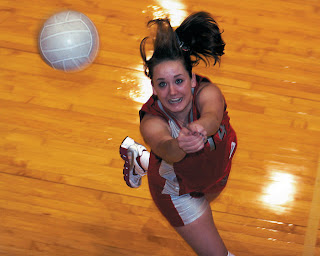
Action & Emotion


This girl is in action by attempting to hit the volleyball and the expression on her face shows that she almost has it.

Wednesday, September 26, 2007

The Story

This picture's story shows kids in a class room and only one person in the whole intire class is doing her work. The rest of the kids are just socializing.

Friday, September 14, 2007

Pinhole photos

GOOD.
This picture has a slight blur on the flowers on the tree
The tree is in focus but the closer flowers from the tree are out of focus.
But other than that its a really good picture and its very colorful. I really like it :]


BAD.
The whole picture is out of focus.
Its very blury but you can still tell
that theres a building in the background.


Friday, August 31, 2007

Photos to Critique

I don't this photo is very good.
Its tooo far and there is lots of extra space.
you can't really see the expression on the girls face.


I think this is a really good photo.


It really cathes this girl in a moment.


The fram is filled and she has emotion.
Welcome to my blog